
Overview
Accordions allow you to display large amounts and multiple sections of content in a small space. It typically consists of a series of headers or tags that, when clicked, expand or collapse their associated content below.

When to use
- If you have to organize related information.
- If you have a page with a lot of content that is less important or relevant, make it shorter.
- If you only have a small space to display a large amount of content, such as in a mobile interface or in a side panel.
Use the accordion component when you have content that can be organized into categories or sections and you want to present it in a way that is easy to navigate and consume. For example use the component in a form with several sections or a list of frequently asked questions.

Behaviour
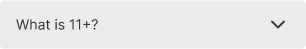
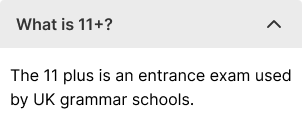
The accordion component has two main states: collapsed and expanded.
By default the first accordion will be open.

Usability guidance
- Create a typography hierarchy between the label and the content within the panel
- Make the entire header selectable. Allow users to click anywhere in the header area to expand or collapse the content.
- Give interactive elements enough space. Make sure interactive elements within the collapsible region are far enough from the headers that users don’t accidentally trigger a collapse. (The exact distance depends on the device.)
Accessibility checklist
When designing your accordion, use this list to make sure that they meet the following accessibility requirements.
- Make sure the label and the icon are both buttons and that they both open the same thing (e.g., your label shouldn’t link you to a page, and your icon opens the accordion). One exception may be with filter accordions where the label may be part of the checkbox.
- Is the closed state of the accordion more than 44px high? (For touch areas)
- Make sure that the accordion works on a tabbing map.
And, when in doubt, visit https://webaim.org/techniques/forms/controls
Do's and Don'ts
Do
Accordion behaviour
Don't
Accordion behaviour
Do
Use different size of typography to differentiate between the accordion headings and the content, making it easier for users to distinguish between the two.
Avoid
Using other colors that are not provided with the component.