
Structure
A section message displays a contextual feedback message in a particular section of the page. They’re persistent and nonmodal. It can include a ‘close’ button to be dismissed, allowing the user to either ignore them or interact with them at any time.

Anatony
- Icon: The icon and section colour pairing signifies the message type and is available in pre-defined styles for each message type.
- Title: The title should be a clear and concise representation of the message's purpose.
- Description: This should detail the message and any necessary actions for the user to take, if any. The message should remain as brief as possible.
- Actions (optional): One or more buttons that allows the user to take action.
- Close (optional): A button situated in the top-right corner that lets users dismiss the message.
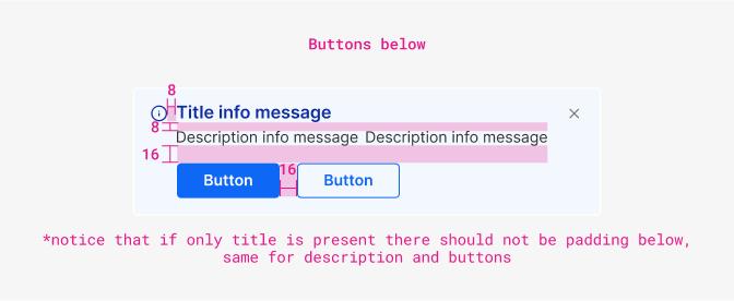
Paddings and margins

| Component | Theme | Appearance | Size | isRounded |
|---|---|---|---|---|
| ‘Close’ Action icon | neutral | simple | sm | no |
| Property & element | Token | px | rem |
|---|---|---|---|
| Padding container | space $4 | 16px | 1 |
| Action Icon margin left | space $2 | 8px | 0.5 |
| Action icon margin top/right/bottom | space $2 | -8px | 0.5 |
| Corner radius container | radii $0 | 4px | 0.25 |

| Property & element | Token | px | rem |
|---|---|---|---|
| Margin-left actions | space $2 | 8px | 0.5 |
| Property & element | Token | px | rem |
|---|---|---|---|
| Margin-right Icon | space $2 | 8px | 0.5 |
| Margin-bottom title | space $2 | 8px | 0.5 |
| Margin-top Actions | space $4 | 16px | 1 |
| Margin between actions | space $4 | 16px | 1 |
Typography

| Element | Family | Weight | Size | Rem | px |
|---|---|---|---|---|---|
| Title | $body | 600 | $sm | 0.75rem | 12 |
| Body text | $body | 400 | $md | 0.875rem | 14 |
Color

| Property & Element - State | Token | Hex |
|---|---|---|
| All variants - border | $white | # |
| All variants - description text | $grey900 | # |
| Info - icon/title | $blue1000 | # |
| Info - background | $blue100 | # |
| Success - icon/title | $successDark | # |
| Success - background | $successLight | # |
| Error - icon/title | $dangerDark | # |
| Error - background | $dangerLight | # |
| Warning - icon | $warningDark | # |
| Warning - title | $warningText | # |
| Warning - background | $warningLight | # |
| Neutral/help - icon/title | $grey900 | # |
| Neutral/help - background | $grey100 | # |