
Overview
A component that lets users select between a group of 2-6 options (segments), all stored in one container.
It should generally be used at the top level of navigation in a page and have a single selectable option.
The segmented control is an alternative to Tabs and Toggle groups, which offers more visual prominence in the page and therefore makes it suitable to use at the top level of a page (rather than within a component/section).
On desktop the segments should all have identical sizes (inherited from the size of the largest one) to present all selectable options as equal, while on mobile the segments can overflow outside the viewport, but wrap tightly around the content to fit as many options on screen as possible.
For a larger amount of options use tabs or select.

When to use
- If you need to add context or secondary information to each of the selectable options in a page
- If a single option of the set may be selected.
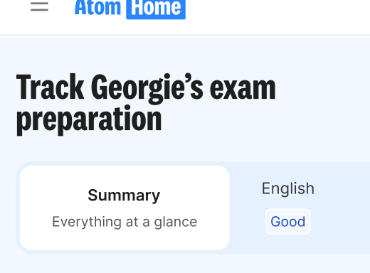
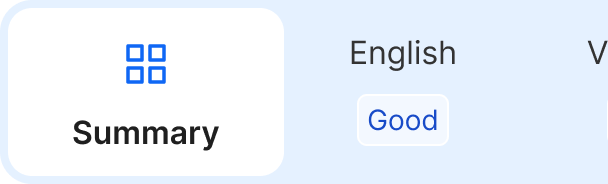
Use a segmented control as a switch between different views. It’s most suitable when an extra description for each of the available views could be helpful to the user to make a selection. For example, use the component to show which subject would require the parent’s attention first in the Track page by including the mastery level as the description.
Copy and secondary information
The secondary information/description in each of the segments can provide useful context to the user that helps them more easily make a selection without them having to go into each of the individual views. This also allows to keep the segment title short and snappy, improving the overall clarity of the UI.
When using text for the descriptions, make sure the copy is clear and concise and is of similar length for all options to make them look visually balanced. It’s recommended that it doesn’t take up more than 2 lines to keep the attention on the segment title itself.
Use sentence case for both the title and description shown.

Size
When building a layout, specify the appropriate size variant of the segmented control, depending on the size of the viewport and the other information/components in the page.
As general guidance, the ‘md’ variant should work for almost all scenarios on desktop breakpoints, while ‘sm’ is recommended for mobile, as it allows for more segments to fit on screen (due to the segment wrapping around the content, rather than expanding to match the biggest option in size). If the rest of the information in the page is larger than usual, or this is one of the few components in the view, the ‘lg’ variant may be suitable on desktop.

Segments with an icon
Segments may also include icons in each option, if you want to bring extra attention to the component within the page.
The icons should all have a consistent size (as per the selected size variant) and match the meaning of the corresponding page, in a way that’s consistent with the application where they’re used.

Do's and Don'ts
Do
Allow the segment to overflow outside the viewport when using on a smaller breakpoint
Don't
Use overly long copy for the description of a segment
Do
Start with a capital letter and use sentence case, but don't add full stops.
Don't
Mix text-only segments with segments with icons
Avoid
Using multiple segmented controls per page. They should only be used for the top-level/most important navigation.