
Overview
Component to indicate progress during more than one step processes.

Steppers are flexible to be placed in different containers such as panels or dialog modals. Placement depends on each use case but the general guideline is for them to sit at the top of the container, taking full-width space and close to related information in the page.
- Always center a stepper above content.
- Steppers automatically distribute steps evenly within the horizontal space they are afforded.
When to use
Use in processes that involve more than one step and you want the user to see their progress and how much is left.

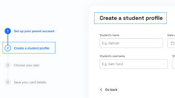
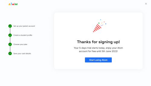
Sign up proccess
Do's and Don'ts
Do
Use in proccesses that involve more than one step and you want the user to see their progress and how much is left.
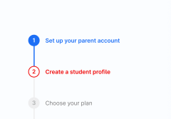
Don't
Show error via color on the stepper. Use other components within the page.
Do
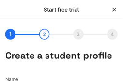
Adapt for mobile version
Avoid
Using long or unclear copies
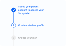
Do
Show success with a microinteractions